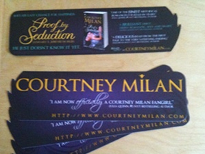
I’ve fielded a few e-mails about the bookmarks I was giving away at Nationals. Here they are:

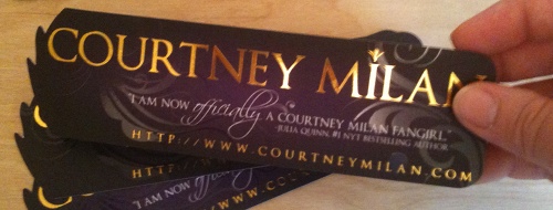
And just because that doesn’t quite give you an idea of the shimmery goodness that is the bookmark, try this:

As you can see, the bookmark has a few distinctive features. It’s die cut. And it’s not just a die cut with rounded corners or a leaf shape; it’s a die cut with a pattern. (The pattern is drawn from one of the random dividers that shows up on my website. This one, to be exact: ![]() )
)
It has my name in gold foil. Shiny!
And it has accents picked out in spot UV.
There were two parts to getting this bookmark made: the design, and the printing.
The printing was the easy part. I used 4colorprint.com. I have had excellent luck with them. I’ve used them to print both business cards and bookmarks now, and both have turned out beautifully. There are some places you can go to get bookmarks printed more cheaply, but I haven’t found anywhere else that has the quality that 4colorprint has (in terms of the stock they use to print on, the quality of the printing, and the breadth of finishing options). All I had to do was mail them a file, and lo and behold, after a short space of time, I had gorgeous bookmarks. I highly recommend 4colorprint for printing interesting and difficult files.
(Incidentally, I was also moving right around the time when I ordered my bookmarks. I asked them to get in touch with me to make sure everything went to the right address, and the staff was fantastic about touching base with me about my order to make sure everything was squared away. So many things could have gone wrong with that. Not one did.)
The design part was harder. Much harder. I started with the idea that I wasn’t going to be scared of spending a little bit more than your every day average bookmark, but I didn’t want to spend insane amounts more. I also think it helped to start with a goal in mind: I wanted a bookmark that (a) made people want to pick it up; (b) made them want to hold it to look at it; and (c) hesitate for at least a split second before tossing it in the trash.
With that in mind, one great resource I used in trying to figure out what sorts of things appealed to me was this Flickr photoset of business cards. Some of them didn’t appeal to me. Some seemed a little too gimmicky for me (and also too hard to store–so they would probably get tossed fairly quickly). Others made me want to reach right into my screen to pick them up and examine them in minute detail. I also walked through bookstores and looked at book covers that caught my eye.
And then I played around. For a long time. You can hire someone to do this for you, but it helps substantially if you have an idea what you’re shooting for, and so don’t necessarily bypass the “looking for things you like” phase.
My critique partner, Tessa Dare, also had gorgeous bookmarks–and you can see them on her site, here. In fact, she’ll even send you some for free!

Honestly, my husband picked yours out of the pile and said, “That’s cool.” Like he reads romance anyway!
so purty *pets precious*