
Over the last few months on twitter, I’ve increasingly seen people linking to covers of historical romances and saying something like UGH this does not look right!
Some of those covers actually have great underlying images. The problem in 99.9% of them is that the typography is…not good. There are usually three ways that people end up with typography that is not good.
- They are doing the typography themselves.
- They have hired the typography out to someone who is not good at typography (e.g., they have used a graphic artist to make the cover, but not all graphic artists are great at laying type.)
- They have hired someone who knows how to do decent typography, but insist on elements that are not good typography. In other words, the client is creating the problem.
This post is specific to historical romance. That’s because I’ve spent a ton of time looking at historical romance covers, and feel like I can talk about them with some reasonable authority. This post is nonetheless not intended to be authoritative, complete, or to serve as instruction for anyone putting together a book cover.
This is a post that is designed to do one thing and one thing only: Tell people things to do on their historical romance cover to make sure the typography sucks.
Without further ado, here are some of the most effective ways to suck (with suggestions as to how to not suck.)
1. Choose a crap font.

This is the biggest one. I can’t tell you how many historical romance covers are ruined by crap fonts. Just about anything you got free on your computer or downloaded from some free site is going to be sheer crap, I’m sorry to tell you. And fonts that are great for the inside of the book–fonts like Garamond or Times New Roman–often don’t do well on the cover for name/title fonts.
As a note, what constitutes a “crap font” in historical romance is not the same thing as a “crap font” in another genre. For instance, Trade Gothic is standard on a number of thrillers. It would look ridiculous on a historical romance. Spend some time looking at covers in your genre to see what kind of fonts people use.
I actually don’t think that the typography above would be absolutely terrible for a certain kind of book.
A great font is not just a great font–it is also a way to brand yourself as an author. Don’t be afraid to spend money on an excellent font. It always annoys me when I see people whining that people won’t buy their book when it’s less than a cup of coffee, but they are unwilling to shell out $50 for an extraordinary font that would brand their books.
(My biggest problem with some of the less-expensive-but-still-professional-looking cover design shops is that they’ve figured out a typography combination that works for them and they keep using it over and over, regardless of the client.
End result? A look that is branded to the cover designer rather than the author.
But given a choice between crap typography and a non-branded cover, I’d say go for the non-branded cover.)
2. Use low-contrast color combinations.

Want people to be able to read your title and your cover? Well, don’t use red-on-red color combinations. This one is fairly easy to see, and yet I keep seeing things like this crop up on Amazon. I really have to wonder at people who put out books like the above. What are they thinking?
3. Use too many fonts.

Using a small number of fonts allows you to create a cohesive feel to your cover. One or two fonts–three at the absolute maximum, and then only after careful consideration–is all that anyone should ever need to make a good cover. Too many fonts will distract the viewer.
4. Don’t pay attention to kerning

Kerning is about the spacing between letters. As a note, this is one of those places where a quality font really matters: a really good font is one where the designer has gone through and specified kernings for every pair of letters. That gives it a professional quality that requires less work on the designer’s part. The random font you got for free off of someone’s website? Probably has crap kerning, and you need to adjust manually.
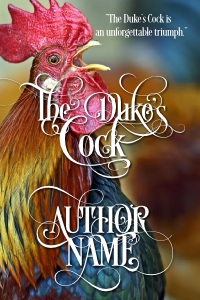
See that space between the “T” and the “H” in the author name? It just looks weird. And unprofessional. Ditto for the space between the “D” and the “u.” If you look at all these letters, you can see that they subtly feel like none of them are properly aligned.
If you don’t know how to kern a font manually, you’re probably not someone who should be doing typography. If your designer doesn’t know how to kern a font, ditto.
5. Use font effects.

You know what? I’m going to go out on a limb and say that if you have any doubts as to your ability to judge typography, you should not use font effects beyond a mild drop shadow. For historical romances, font effects are basically death. I include in this flashy color gradients, fonts on a wavy path, fancy texturing or beveling of the font… You name it, I don’t want it. Font effects are the opposite of tasteful covers. They are harder to read at best, and migraine-inducing at worst. The worst fug in the world comes from font effects.
DO NOT USE.
6. Use all the whizbang.
Yay, you spent a ton of money on an awesome font, and now you want to show it off. Your font has whizbang. So much whizbang! You cannot wait to show everyone all your whizbang.
Please restrain yourself. A few bits of whizbang are enough for any one cover. Too much whizbang is hard to read, and that distracts people from the cover itself. You are better off having no whizbang than too much.
7. Don’t balance your cover elements.

This is actually a really, really subtle point–the typography above is actually not horrendous. But in this case, it has been centered with a computer and left like that. The end result is that it looks unbalanced. The “The” is hanging over the “Duke” and there’s a large gap that makes it perceptually look like it’s farther away (even though I have set the baselines of all three words to be equidistant). “Dukes” and “Cock” do not appear to be centered with respect to each other. And the elements are placed over the image without any thought as to what will draw the eye on the image itself–note that the eye is naturally drawn to that white spot right by the rooster’s wattles, and the text placement does not logically follow from that spot.
Typography is not just about placing elements over an image; it’s about bringing things together into a cohesive whole.
If you cannot tell why items 1-7 are not great examples of historical romance typography, and you’re thinking to yourself, “Wow, that does look GREAT on a curvy path!” do not do your own typography. You do not have the skills you need. In fact, you are the opposite of what you need, and you need to get out of your own way.
(It’s okay. Everyone sucks at something.)
If you look through a designer’s portfolio and see them using only cheap/free fonts with terrible kerning, do not use them. Et cetera and so forth.
Things you should do if you want to not suck
(Note: I basically banged all these images out over the course of half an hour, and now I’m looking at this and still want to fiddle–especially with moving around the title/author name–but since I am not, in fact, using this for anything except illustration purposes, I’m just going to leave it like this, even though I’d probably still make changes.)

1. Use typographical elements to draw the eye back to the image rather than send it away.
2. Pay attention to how typographical elements interact with each other–in this case, the “D” and the “C” in the title interlock with each other, and I’ve moved the “The” to give a sense of balance. Rather than having the swirl from the R intersect the middle bar of the “E” as in the above image, I’ve deleted the middle bar, so the elements flow together.
I do not pretend this is the best historical romance cover ever (for more reasons than one). But it is, at a minimum, not guilty of horrendous fug. And if you are nitpicking things about this cover, yay, congratulations, you may be nitpicky enough that you can do typography!
3. Use a great font sparingly. This font is called Desire, and it is made by Borges Lettering. It is the only font used on the cover for the last three images. (You can see that the font has a lifetime supply of whizbang, should you wish to use it–use with care.) You can get it here:Â http://www.myfonts.com/fonts/charlesborges/desire/
4. Make sure that the typography and the image interact well. Don’t cover over parts of the image that you want people to focus on; make sure you choose an image that has a lot of places to overlay font with a great color contrast. (This, by the way, is the primary driver of the “girl in a massive dress” cover–because the dress serves as a blank palette to overlay text on.)
All righty. That’s my short course on how to suck at typography. I’m sure I’ve left off a bunch of items, so please feel free to add your own tips in the comments!
Reader/book shopper here. I’d just like to point out that in none of those covers can I read the tag line. So, you know, I hope it’s not important. 🙂
This is why I pay money to an artist who understands these things.
Entertaining and informative as always! Thanks, Courtney!
I proudly suck at type! No matter what I try, it looks like my 3rd grader made it. On a bad day. With crayons.
Therefore, after I’ve gone half blind finding *just* the perfect image for my covers, I pass that sucker right off to my best friend, who is a designer. Et voila. But we do have some goofy conversations because I don’t know the lingo. I’ve said: “That’s beautiful, but staid. Can you cheese it up a little? Make it like… swoopier? And the text shouldn’t all be the same color. I mean, it should all be blue, but, like, not all the *same* blue!”
Hence, I learned the word “ombre,” which is totally a thing in New Adult contemp right now.
Thank you for this!
In #5, another reason to be cautious with font effects: the curved line for the title, er, gives unfortunate connotations when combined with the text. (Perhaps some sildenafil needs to be added to the chicken feed?)
Excellent article; I’m sharing this with several book designers I know who will get a good laugh!
Wonderful post, Courtney!
What software do you use to add the text? And do you have any tips on how to determine if a font is any good?
Ooh, I like this post. I think I’m in the category of “capable of doing my own covers, but possibly just barely” — I cringed outright at the first six covers and have Thoughts on how to improve the seventh. Though so far I’m still going with free fonts…but carefully.
Anyway. Love your posts and blog. (And books! I have the Suffragette one taunting me from my Kobo as I type. :D)
Awesome article!