So my cover for my September release is finally up on Amazon!
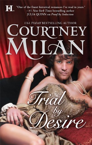
So? What do you think? Red is good. I like red.
I am leaving the house as I type this, and my internet access will be crap, so my apologies if I don’t end up responding quickly.

So my cover for my September release is finally up on Amazon!
So? What do you think? Red is good. I like red.
I am leaving the house as I type this, and my internet access will be crap, so my apologies if I don’t end up responding quickly.
Comments are closed.
Hey, wait! I thought male cover models didn’t have faces above their noses. I LOVE the expression on his face. I like the colors. Very rich.
Love the pearls. 😉
Ooh, he’s very cute!! They left it very photographic, too, which is interesting. And red and black combo covers supposedly sell very well! (Eye-catching, etc. Plus those blue eyes!!)
Gorgeous – rich colors, lovely man, sexy pose, it’s got it all.
Her dress is lovely. I want one!
That’s a great cover. Love the colors and the beautiful poses for both the lady and the gent. I love the gent’s eyes as well.
That’s one of the best romance covers I’ve ever seen.
Oh, like it. Tho as a mom I want to tell him to get his bangs trimmed. *sigh*
It’s very striking. I love the red and the poses. I actually like that you get the full face. Kind of reminds me a little bit of Amanda McIntyre’s The Master and the Muses cover because of the direct stare at the viewer by the hero on the cover.
That being said, I’m not sure that I like his face. I guess maybe he’s just not my type….not ruggedly handsome enough. Overall I think it’s a beautiful cover and can’t wait to read it!
Very eye-catching! I love it. And congrats on being a bestseller!
Is it my imagination or does the male model look like Bill from True Blood?
RAWR! That guy is one real hottie!
Oh, I like it, very much indeed!
Yes, Bill from True Blood! His eyes are amazing!
And I’ll fight K for the dress. 🙂
This is a sumptuous cover. I absolutely love it. Congratulations on the new release. I wish you huge sales.
Thank you all so much for the cover love! I wish I could take credit, but it’s all the HQN art department.
And Booklover1335, I do have to admit that the gentleman on the front isn’t my type either. But then, I tend to go for guys with glasses, so I’ve pretty much given up on having one of those on my cover. 🙂
Breathtaking…The rogue is not my type, but he does justice to the cover. congratulations..wish you the best..
Wow, Ned has certainly aged well 😉
Beautiful cover, can’t wait to get my hands on this book!
I like the cover a lot, but I pictured Ned as being a bit more youthful. Maybe it’s his earnestness, but I picture him as almost boyish in Proof By Seduction. How many years lapse until Trial By Desire takes place?
It’s absolutely gorgeous! The guy is cute–he reminds me of Hugh Dancy!
I am seeing Mickey Dolenz of the Monkees. Now after branding myself as ancient, I always thought he was cute.
I love the red cover. I think red is going to be the new purple on covers (or maybe I’m just hoping as I love the two colors). Very beautiful cover, and I cannot wait to read it!
Wow, the cover is absolutely gorgeous. And Ned, I just can’t decide what I think of him. I look at him and I think he is too pretty, but he has a bit of an edge to him that makes him that much more enticing. Excellent choice!
The pearls do seem to bring it all together for me.
I can’t wait until it is in the mail on the way to my house. 😀